Look and feel of the Release Notes...
Date: Sun, 2 Jun 2013 18:24:15 -0700 (PDT)
Two little things bother me with the formatting of the release notes.
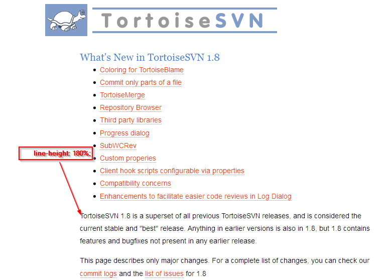
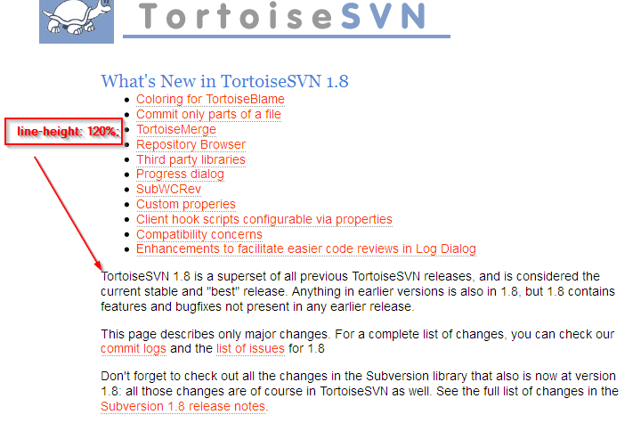
1. Default Paragraph line spacing is 180% - this looks 'double spaced', like an essay at university. I have a mockup of the paragraph css set to 120% (attached)
2. Spacing before each new <h2> heading is insufficient (sections don't look separated enough). Currently spacing is 10px, suggest at least 20px, except for the very first h2, which should not be 20px.
Changes would go into the pack.css.
This is very much a style thing, and I don't feel that strongly about it, but if people agree I will make the change.
I also don't know if there is a side effect (i.e) who else is using pack.css?
Friedrich Brunzema
------------------------------------------------------
http://tortoisesvn.tigris.org/ds/viewMessage.do?dsForumId=757&dsMessageId=3056946
To unsubscribe from this discussion, e-mail: [dev-unsubscribe_at_tortoisesvn.tigris.org].

