Bug: Suboptimal elements placement in Repo URL dialog
From: Dmitry <wipedout_at_yandex.ru>
Date: Tue, 13 Apr 2010 12:29:49 +0400
Hey.
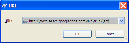
On my large fonts system the Repository URL dialog looks suboptimal. See attach. The distance between the "URL" label and the URL combo is sooo huge and much greater than the distance between the "URL" label and the left dialog border.
With such placement it looks like the label and the combo are completely unrelated. I suppose the distance between the border and the label should be kept as is and the distance between the label and the combo should be made a bit smaller than the distance between the label and the border. This way the two elements will be perceived as connected and the dialog space will be used more efficiently.
Best wishes.
------------------------------------------------------
To unsubscribe from this discussion, e-mail: [dev-unsubscribe_at_tortoisesvn.tigris.org].
|
This is an archived mail posted to the TortoiseSVN Dev mailing list.
This site is subject to the Apache Privacy Policy and the Apache Public Forum Archive Policy.